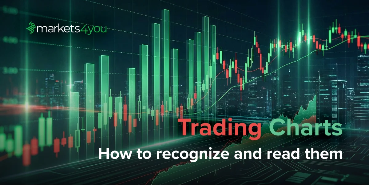
Types of Forex Charts and How to Read Them
Forex charts are the foundation of technical analysis. Whether you’re a new trader learning price action or an experienced trader refining entries, every decision you make comes from what you see on the chart. Trend direction, momentum, volatility, and liquidity reactions all appear visually, without charts, trading becomes guesswork in a fast-moving market.
Modern platforms and forex charts apps offer real-time data across multiple timeframes, but many traders overlook one key factor: the chart type they’re using. Each chart displays prices differently.
Candlesticks highlight sentiment, line charts simplify direction, Renko charts focus on pure price movement, and Heikin-Ashi smooths trends. The wrong chart type can distort your view, while the right one helps you spot structure, trends, and reactions more accurately.
Chart reading also depends on understanding how prices are displayed. If you need a refresher, our guide to forex quotes and currency conversion explains the basics, bid/ask, pips, and how currency pairs behave.
Why Chart Choice Matters for Traders
Many traders treat chart type as a visual preference, but it directly affects how you interpret the market. Each style highlights different elements, and each hides something important.
- Line charts remove noise and show clean direction but hide highs, lows, and sentiment.
- Candlestick charts reveal momentum, rejection, and emotion in the market — but can feel noisy during volatile periods.
- Heikin-Ashi charts smooth candles for clearer trends, though they lag behind real price.
- Renko charts remove time and filter noise, ideal for trends but slower in fast markets.
- Tick charts build candles based on number of trades, exposing real activity but requiring experience to interpret.
Using the wrong chart type can cause you to misread trend strength, mistake noise for structure, or miss early signs of reversal. A breakout may look strong on a candlestick chart but weak on a Renko chart. A trend that looks smooth on Heikin-Ashi may look choppy on standard candles. Patterns can disappear depending on the chart type you use.
Chart choice also affects risk. Candlestick traders may place stops too tightly during volatile sessions. Heikin-Ashi traders may enter or exit late due to smoothing. Renko traders may experience delayed signals during rapid price changes.
Understanding how each chart type frames information helps you choose the right tool for the right situation. When your chart selection aligns with your strategy, your analysis becomes clearer, more consistent, and far more accurate, and consistency is what drives long-term success.
Major Forex Chart Types
Now that we understand why chart choice matters, we can explore how each chart type works and what kind of insight it offers. Each chart has its strengths and limitations. Understanding these distinctions helps traders match the right tool to the right analysis scenario.
Below are the most widely used chart types in forex trading, from beginner-friendly line charts to more advanced formats that filter noise or highlight pure price movement.
1. Line Charts
Line charts are the simplest and cleanest representation of price. They connect the closing prices of each interval to create a single, flowing line. This simplicity is valuable in a market that often feels overwhelming.
Strengths of Line Charts
- They offer a clear view of overall trend direction without distraction.
- They make it easier to observe macro structure across higher timeframes.
- They help traders avoid reacting emotionally to intraperiod spikes or volatility.
- They simplify the identification of major support and resistance levels.
Line charts are particularly useful for traders who work top-down. When starting your analysis on the daily or weekly chart, a line chart helps you see the “shape” of the market before diving deeper with more detailed chart types.
Limitations of Line Charts
- They hide wicks, highs, and lows: the elements that reveal sentiment.
- They don’t reflect volatility or intraperiod behaviour.
- They are not suitable for timing precise entries or reading forex chart patterns.
In short, line charts are ideal for orientation, structure mapping, and direction — but not decision-making alone.
2. Bar Charts (OHLC Charts)
Bar charts display each period as a vertical line marking the high and low, with small ticks at the left and right to show the open and close. They are cleaner than candlesticks but more detailed than line charts.
What Bar Charts Reveal
- Full volatility range within the period
- Momentum strength based on the relationship between open and close
- Liquidity zones symbolised by long highs and lows
- Natural swing points that help define market structure
Bar charts appeal to traders who appreciate the informational depth of candlesticks but want a cleaner visual representation.
Limitations of Bar Charts
- Beginners may find the open/close ticks confusing initially.
- They don’t offer the same intuitive storytelling as candlestick bodies and colours.
Still, bar charts remain popular in institutional settings because of their accuracy in displaying OHLC data without emotional colour cues.
3. Candlestick Charts
Candlestick charts are the most widely used chart type in forex trading today. Their strength lies in how intuitively they express price psychology. A candle represents four key data points — open, close, high, and low — but also shows:
- rejection at key levels
- strength or weakness of momentum
- shifts in market sentiment
- patterns that form visual clues about future direction
Why Traders Love Candlesticks
- Candle bodies reflect buying or selling pressure.
- Wicks show rejection, liquidity hunts, and exhaustion.
- Patterns such as engulfing candles, pin bars, and doji hint at reversals or continuation.
- They are ideal for analysing price action and recognising forex chart patterns.
Candlesticks also combine well with indicator-based strategies. Tools like moving averages, oscillators, and momentum indicators enhance pattern interpretation. If you’d like to understand indicators more deeply, our introduction to trading indicators is a strong companion to this section.
Limitations of Candlestick Charts
- They can feel noisy and overwhelmed in fast markets.
- Traders may overreact emotionally to every candle.
- Patterns require context (structure, trend, and volatility) to be reliable.
Nonetheless, candlestick charts remain unbeatable for understanding sentiment and real-time price action.
4. Heikin-Ashi Charts
Heikin-Ashi charts use a mathematical formula that averages price data. This smooths out candle irregularities and gives a clearer representation of trend strength.
What Heikin-Ashi Charts Reveal
- Strong, consistent trends without micro-level fluctuations
- Smooth transitions between bullish and bearish phases
- Fewer false reversal signals during volatile periods
- Clearer visual representation of continuation patterns
Heikin-Ashi charts are especially popular with swing traders who prioritise clear structure over precision. Because the candles average price, they lag behind real market values, making them unsuitable for scalping or tight stop-loss strategies.
Limitations to Consider
- Actual price levels may not match the Heikin-Ashi candle close.
- They delay entry and exit signals due to smoothing.
- They are not designed for detailed candlestick pattern reading.
Heikin-Ashi is a powerful tool when your goal is clarity over precision.
5. Renko Charts
Renko charts offer a radically different approach to visualisation. Rather than forming candles at fixed time intervals, Renko charts create “bricks” only when price moves a predetermined number of pips. Time is irrelevant; only meaningful movement matters.
What Renko Charts Reveal
- Pure trend direction without minor retracements
- Clear breakout and breakdown signals
- Simplified structure ideal for spotting reversals
- High-quality swing points that define price waves cleanly
Renko charts shine in trending environments where normal candlestick noise obscures directional clarity.
When Renko Works Best
- For identifying clean trend continuation setups
- For filtering out false reversal signals
- For mapping structure on medium-to-long time horizons
- For avoiding overreaction to intraday volatility
However, Renko charts may delay signals during fast markets, making them less suitable for intraday scalping.
6. Tick & Volume Charts
Tick charts form a new candle after a set number of trades (e.g., every 100 trades). Volume charts use trading volume instead of ticks.
What They Reveal
- True activity rather than timed intervals
- Changes in liquidity and order flow
- Entry opportunities during sudden bursts of volatility
- Micro-level structure that is invisible on time-based charts
Ideal Use Cases
- Scalping
- High-frequency strategies
- Analysing real market flow during major sessions
- Trading news events with precision
These charts require experience to interpret but can become powerful tools once mastered.
Interpreting Charts for Trading Decisions
Understanding chart types is only the first step. The next step, and arguably the most important, is learning how to interpret what you see. Successful traders combine structure, sentiment, volatility, and liquidity to form a complete picture of market behaviour.
1. Identify Market Structure
Market structure provides the framework for all analysis. Before looking at patterns or signals, determine whether the market is trending, ranging, or transitioning.
- Uptrend: price forms higher highs and higher lows.
- Downtrend: price forms lower highs and lower lows.
- Range: price oscillates between horizontal support and resistance.
Once structure is defined, traders can more reliably anticipate continuation or reversal.
2. Mark Support & Resistance
Support and resistance act as psychological and liquidity-based turning points. Price often reacts strongly at these areas, showing:
- rejections
- consolidation
- breakouts and retests
- liquidity sweeps
Marking these levels across timeframes strengthens your forex charts analysis and reduces false entries.
3. Read Candlestick Sentiment
Candlestick behaviour reveals how buyers and sellers interact within each period:
- Strong bodies show momentum.
- Long wicks signal rejection or liquidity grabs.
- Small bodies show indecision or balance.
- Engulfing candles indicate a shift in control.
When combined with structure, candle sentiment becomes a powerful tool.
4. Recognise Chart Patterns
Chart patterns provide visual clues about future direction. Common patterns include head and shoulders, triangles, flags, wedges, and double tops/bottoms. While no pattern is perfect, combining them with trend context and volatility analysis improves accuracy dramatically.
5. Understand Volatility & Liquidity
Markets rotate between expansion and contraction. Tracking these phases helps traders anticipate breakouts, identify fading momentum, and avoid trading during unpredictable volatility spikes.
Selecting and Using Chart Types Strategically
Each trader naturally gravitates toward certain chart types, but the most effective traders know when to switch views based on their objective.
- Scalpers use tick charts, M1/M5 candles, and small-brick Renko for micro-precision.
- Day traders rely on candlesticks and bar charts paired with line charts for directional clarity.
- Swing traders often combine candlesticks with Heikin-Ashi or Renko to filter noise.
- Position traders use line and bar charts on D1–W1 to track macro structure.
Regardless of style, chart interpretation must be paired with disciplined risk control. For structured methods that complement technical chart reading, explore our >complete guide to managing risk in forex trading and try to use different trading charts for your success on Markets4you.
Common Pitfalls & Best Practices
Common Mistakes
- Overanalysing noisy candles
- Switching chart types too frequently
- Ignoring higher-timeframe context
- Misreading reversal patterns without structure
- Using indicators without understanding price first
Best Practices
- Start analysis from higher timeframes
- Use multiple chart types only when necessary
- Keep charts clean and uncluttered
- Combine structure, sentiment, and volatility
- Avoid emotional reactions to single candles
- Confirm setups with multiple signals
FAQs
-
Do professional traders rely on chart types alone?
No. Professional traders use chart types as one component of a wider analysis framework. They combine charts with market context, liquidity behaviour, macro factors, and strong risk management. Chart types help visualise price, but decision-making requires multiple layers of confirmation.
-
How can I avoid misreading reversal patterns on forex charts?
Always read reversal patterns within the proper context. Confirm the pattern against higher-timeframe structure, trend direction, and key support/resistance zones. Relying on a pattern alone, without structure or volatility analysis, increases the risk of false reversal signals.
-
Why do my charts look different across trading platforms?
Charts can differ due to variations in broker pricing feeds, liquidity providers, server timezone settings, and spread models. These differences affect how candles form, especially on lower timeframes where even a few seconds can change the open or close.
-
Are Heikin-Ashi or Renko charts useful for forex trading?
Yes. Both chart types are widely used for trend and structure clarity.
- Heikin-Ashi smooths candles to highlight continuation phases.
- Renko filters out small fluctuations and focuses purely on meaningful price movement.
They are excellent tools when used alongside standard candlestick analysis.
-
When should traders switch between chart types during analysis?
Switch charts when you need clarity for a specific purpose:
- Use line charts for clean higher-timeframe structure.
- Use candlesticks for sentiment and precise entries.
- Use Heikin-Ashi for trend confirmation.
- Use Renko to filter noise.
Switching is most effective when each chart serves a distinct analytical role.
-
How do chart types affect the accuracy of technical signals?
Different chart types highlight different aspects of price. Candlestick charts show wicks and sentiment, making them ideal for detailed signals. Heikin-Ashi and Renko smooth movement, improving trend clarity but slightly delaying signals. Line charts reduce noise but may hide important candle behaviour. Choosing the correct chart enhances signal accuracy.
-
Which forex chart is best for price analysis?
Candlestick charts are generally the best for price analysis because they display complete OHLC data, show rejection wicks, reveal sentiment shifts, and form reliable chart patterns used across all technical analysis methodologies.
-
Are bar charts still used in forex trading?
Yes. Bar charts remain popular among institutional and experienced traders who prefer a cleaner, data-focused representation of price without the visual emphasis of coloured candle bodies.
-
Why do forex charts look different on different platforms?
Forex charts can vary due to differences in data sources, liquidity providers, execution models, and server timezones. These factors influence candle close times, price feeds, and overall chart appearance.